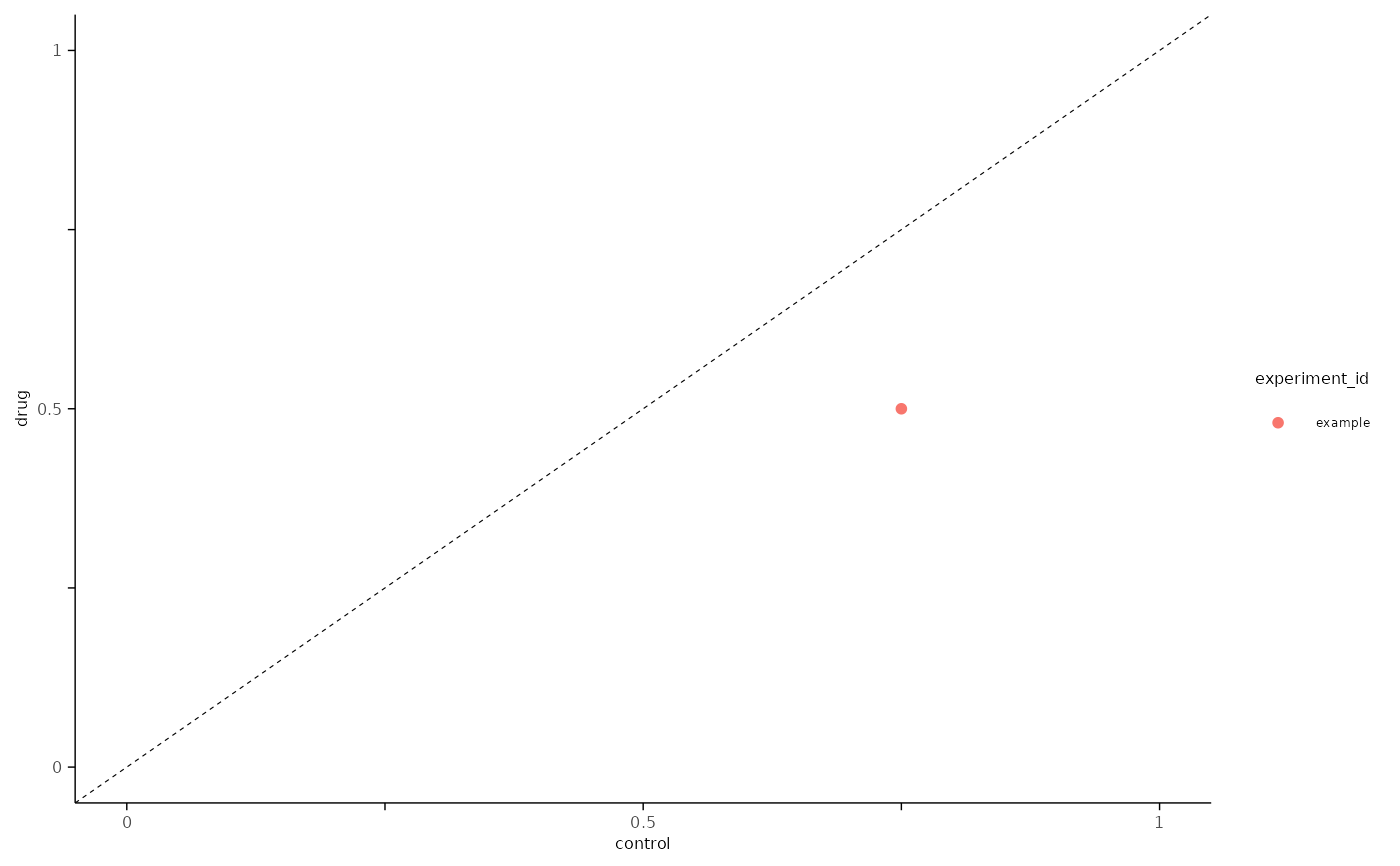
This will plot the maximum value specified by metric across two conditions.
Usage
plot_max_probability(
  df,
  x_axis_condition,
  y_axis_condition,
  metric = "probability",
  xmax = 1,
  ymax = 1,
  x_label = NULL,
  y_label = NULL
)
Arguments
- df
Data Frame or Tibble with the following columns:
cell_id
experiment_id
condition
P() metric from
create_histogram_df(), e.g. density, probability.
- x_axis_condition
Character, condition value to use on x-axis, e.g. "control".
- y_axis_condition
Character, condition value to use on y-axis, e.g. "drug".
- metric
Character, P() metric to plot, e.g. density, probability. Defaults to "probability".
- xmax
Optional integer, maximum x-value to plot, values are rounded the nearest 1. Default is
1, ymin is fixed at0.- ymax
Optional integer, maximum y-value to plot, values are rounded the nearest 1. Default is
1, ymin is fixed at0.- x_label
Optional character, custom label for the x-axis. Default
NULL, will use the column name fromx_axis_condition.- y_label
Optional character, custom label for the y-axis. Default
NULL, will use the column name fromy_axis_condition.
Note
This function is intended to use with aggregated data in a long format that is extracted
from create_histogram_df.
See also
analysis_evoked_ap()for a workflow example that aggregates create_histogram_df.
Examples
library(magrittr, include.only = "%>%")

bins <- seq(0.5, 39.5, by = 1)
n_bins <- length(bins)
conditions <- c("control", "drug")
n_conditions <- length(conditions)

# example output from create_histogram_df()
simple_tbl <-
  tibble::tibble(
    cell_id = "cell",
    experiment_id = "example",
    condition = rep(conditions, each = n_bins),
    h_bin_centers = rep(bins, n_conditions),
    probability = 0,
    density = 1
  ) %>%
  dplyr::mutate(probability = dplyr::case_when(
    condition == "control" & h_bin_centers %in% c(1.5, 11.5) ~ 0.75,
    condition == "drug" & h_bin_centers %in% c(1.5, 11.5) ~ 0.5,
    .default = 0
  ))

plot_max_probability(
  simple_tbl,
  x_axis_condition = "control",
  y_axis_condition = "drug",
  metric = "probability",
  xmax = 1,
  ymax = 1
)
