Scatter Plot Of Event Amplitudes Over Time
Usage
plot_scatterplot_amplitude(
  df,
  sweep_duration,
  filename = "",
  experiment_id = "",
  monochrome = FALSE,
  truncate_x = FALSE,
  ymax = NA,
  y_label = NULL
)
Arguments
- df
Data frame or Tibble, a single experiment data set with the following columns:
sweep
condition
amplitude
stimulus
- sweep_duration
Required integer, sweep duration in seconds that is used to convert the x-axis into minutes.
- filename
Optional character, a single file name to add to the plot title, defaults to "".
- experiment_id
Optional character, add a subtitle with experiment id, defaults to "".
- monochrome
Boolean, set all plot points to a default black color for all conditions. Default is
FALSE, which will use default ggplot2 color scheme for different conditions.- truncate_x
Boolean, only plot points that occur during a condition. Default is
FALSE, and all x-axis points will be plotted.- ymax
Optional integer, set a y-axis limit. Default is
NULLand the y-axis will be automatically determined by ggplot.- y_label
Optional character, custom label for the y-axis. Default
NULL, will use the df column name, "amplitude".
Value
A ggplot2 object with the following features:
X-axis of time (minutes)
Y-axis of event amplitude (pA)
Examples
library(dplyr)
#>
#> Attaching package: ‘dplyr’
#> The following objects are masked from ‘package:stats’:
#>
#> filter, lag
#> The following objects are masked from ‘package:base’:
#>
#> intersect, setdiff, setequal, union
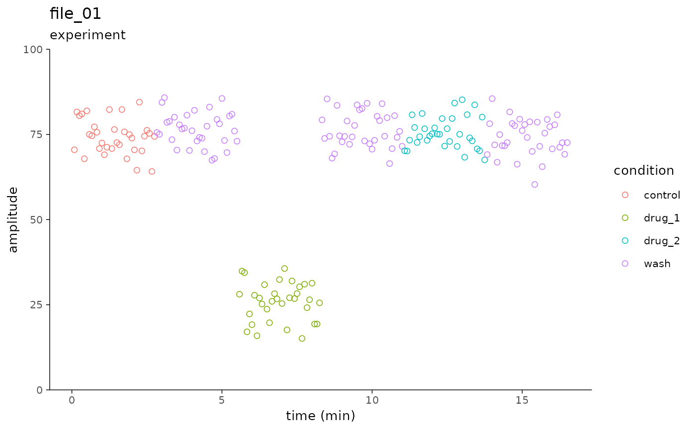
n <- 198
simple_tbl <-
data.frame(
sweep = rep(1:n, each = 1),
condition = rep(c("control", "wash", "drug_1", "wash", "drug_2", "wash"), each = n / 6),
amplitude = rnorm(n, mean = 75, sd = 5),
stimulus = rep(1, n)
)
simple_tbl <-
simple_tbl %>%
dplyr::mutate(amplitude = ifelse(condition == "drug_1", (amplitude - 50), amplitude))
plot_scatterplot_amplitude(
df = simple_tbl,
filename = "file_01",
experiment_id = "experiment",
sweep_duration = 5,
monochrome = FALSE,
ymax = 100
)
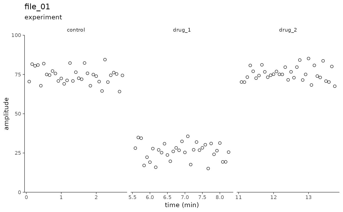
 # Limit the x-axis to segments with a pharmacological condition ----
conditions_only_tbl <-
simple_tbl %>%
dplyr::filter(condition %in% c("control", "drug_1", "drug_2"))
plot_scatterplot_amplitude(
df = conditions_only_tbl,
filename = "file_01",
experiment_id = "experiment",
sweep_duration = 5,
monochrome = TRUE,
truncate_x = TRUE,
ymax = 100
)
# Limit the x-axis to segments with a pharmacological condition ----
conditions_only_tbl <-
simple_tbl %>%
dplyr::filter(condition %in% c("control", "drug_1", "drug_2"))
plot_scatterplot_amplitude(
df = conditions_only_tbl,
filename = "file_01",
experiment_id = "experiment",
sweep_duration = 5,
monochrome = TRUE,
truncate_x = TRUE,
ymax = 100
)